Sunday, January 25, 2009

The Goblin Remembers!

Ok, due to the requests of hundreds (from Sam Hundreds, the kid down the street), I'm back with more of my old artwork. This one's a doozy.

I was so into "re-creating" comic covers as a kid, so here's one from around 1974. Marvel was bringing back the Green Golbin in the comics then, in the guise of Harry Osborn, and this is my entrant into that little fun scene.

I love how I tried to introduce some new Goblin "inventions!" Looks like Spidey is trying to bust thru some sorta bag or force field Gobby is using....


I THINK that's a chair that's getting roughed up in the battle. They don't make 'em like they usta...Not much on backgrounds then. C'mon. Backgrounds were boooo-ring!

Again, meticulous attention to cover detail, such as logo and little corner box icon, which here looks like a tiny Spider-Man mite peeking in over the thought balloon! Heh.

So much for me trying to hide my signature in the art, ala John Romita Sr! VERY subtle!


Student Art!

I teach a twice-weekly cartooning class, and am always surprised by the art and creativity of my students....

With no further comments from me, here are images of Batman and his crew, and a new look at Spongebob...


Sunday, December 7, 2008

Woody!


My take on obnoxious favorite Woody Woodpecker.


Thursday, November 27, 2008

A Tale of Two Batmen!

Let me get this straight up front. I love Neal Adams' work. Always have, since I was a kid in the early 70s. He's an incredibly talented draftsman.

As an adult, I just don't see the merits, tho, of approaching superheroes in such a super-rendered style. It seems silly and over-worked and overdone. Maybe because I'm sick of the last 2 decades of comics, with this as a major trend.

This new attitude may have emerged during my tenure as one of the merchandise artists for the BATMAN-THE ANIMATED SERIES products and merchandise. Made me tale another look at the seemingly easier (it's not-try it) visual approach to figures and design that's all about what you can leave OUT (a sign of a true master, said the late Alex Toth), and not what you put in.

A few months back, I took the grossly over-boiled Neal Adams cover to a recent BATMAN hardcover book, and re-worked it in the "Animated" style (roughly). Squint at both drawings. One stands out as a bold figure in action, and the other? A mess of thin lines, jittery hatching, and syrupy colors. Too much.

This style also allows the artist to get to what makes a character like Batman visually appealing. Think of how you thought of the character at age 7 or so. The dark masses of black. The ears. The glove fins. The chest insignia. The action poses. Speak to those cool iconic points in the drawing, and you get to the heart of the character.

Saturday, September 20, 2008

New Look for Robin!


Don't want you to think I'm picking on poor old Robin these days, but here is a 1975 drawing I did for DC Comics!

Well, sorta.

Anybody recall DC's mid-70s "New Look for Robin" reader contests back then? They'd run fan's drawings of new costume ideas for the former Boy Wonder in the pages of their late, great, content-stuffed  BATMAN SUPER SPECTACULAR issues. I think future pros like Norm Breyfogle even got his drawing published then.

Anyway, this was my entry. Don't think I ever sent it in. 

That might be a good thing.

Although I loved the classic Robin get-up, and agreed the short pants wouldn't go in the real world, I saw this as a chance to get my name and work in print.

Dig that angular left shoulder. I was doing the "Bruce Timm" thing 20 years early!

I also love the repeating "Rs" on Robin's gloves. Years before the "love"and "hate" hand tattoos...Do they leave the insignia embedded on his foe's chins?

I'm sure I saw the "Earth 2 Robin" outfit by then. This seems to be very much based on that costume in many ways.

But, red and blue together?

No.

Sunday, July 20, 2008

Batman!


Lets' get back to the character that started it all for me--Batman!

A pal once looked at some of these early drawings of mine and commented on how violent they were. Batman and Robin were always depicted hitting, punching, slugging, crushing, gouging, kneeing, clubbing, tripping, or kicking their foes.  And why not? That's what they did, right? Both in the comics and on reruns of their 1966 live-action show, the DYNAMIC duo kept in constant motion! If you draw Tarzan, you depict him swinging on a jungle vine, no?

But, yes, these do seem awful extreme to be a child's drawings.

I was learning to use such comics art conventions as impact bursts, jiggle lines, speed lines, etc. Still pushing that extreme depth, with overlapping, foreshortening, and size relationships really accented.

I figure this illo comes from 1975 or so, from a Silver Age Carmine Infantino-drawn Batman reprint in the back pages of the dearly departed mag BATMAN FAMILY. Always dug the villain Cluemaster, Riddler rip-off or not.

Have NO idea what that black mass is I put behind Robin., Shadow? The inside of his cape?

Notice, too, how one of the foes Robin is manhandling and generally abusing is the Joker.

Speaking of details-I recall HAVING to put those exact TWO stripes n Robin's sleeves back then. Every time. My slavish attention to costume detail.

I also seemed to be influenced by the Mego Robin head sculpt then. That blockhead look, cowlick hair, large black mask...


Saturday, July 19, 2008

More Early Spidey!

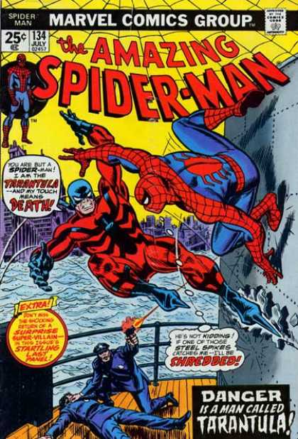
Here is a 1974 drawing where I attempted to re-create that days' Spidey adventure on PBS TV's THE ELECTRIC COMPANY! If you recall, the producers of that fun show made up their own custom SPIDEY comic covers for the intro to the  Spider-man live-action segments. Here Spidey tackles the "Spoiler!" I knew the producers used the cover to AMAZING SPIDER-MAN # 134, so I did the same in creating this work of art!

I had a thing for trying to fully re-create comic covers, as if I wanted a dry run for when I'd be doing the real thing. My "covers' HAD to have the logos, indicia, and all marks as the originals had! Very odd.

I also was very much into the little details of hero costumes. I had to show the viewer I knew how the back of Spidey's costume looked, how the web pattern was laid out, always careful to also draw the little web-shooter openings at the palms of the gloves! Maybe that's a boy thing?

Notice how I got bored and added odd little sketches to the left of the drawing, as well as under the Spidey figure.

Still struggling with the "big head/tiny body" thing....

Looks like I also chickened out of fully coloring the whole image.